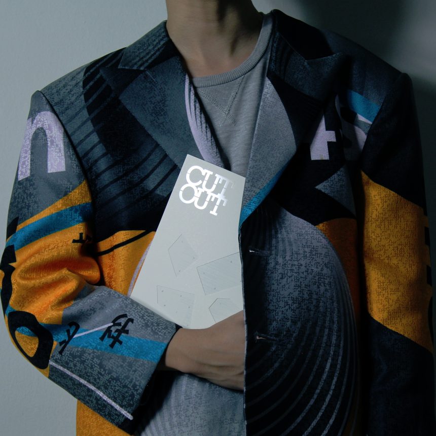
Starting from this issue, the look and feel of CUTOUT shifts to a clean and minimal style. We start to embrace the white space in a design. Overall, the magazine has no overly bold or loud illustrations. Even the binding on this magazine is not fully stuck together, which is another representation of “naked”.
CUTOUT’s Naked issue is about looking at interpretations of the word, and how it is being applied to design. The cover comes across as unpretentious, barren of all colours and stands out in plain beige with die-cuts in the middle creating pocket holes for a see-through effect. It is noteworthy that Naked as a word can trigger different kinds of imagination in people’s heads. Often, designers and artists think or see more than just “a body without clothes on”. Their masterpieces are explorative, away from predisposed judgmental thoughts about what Naked should represent.

