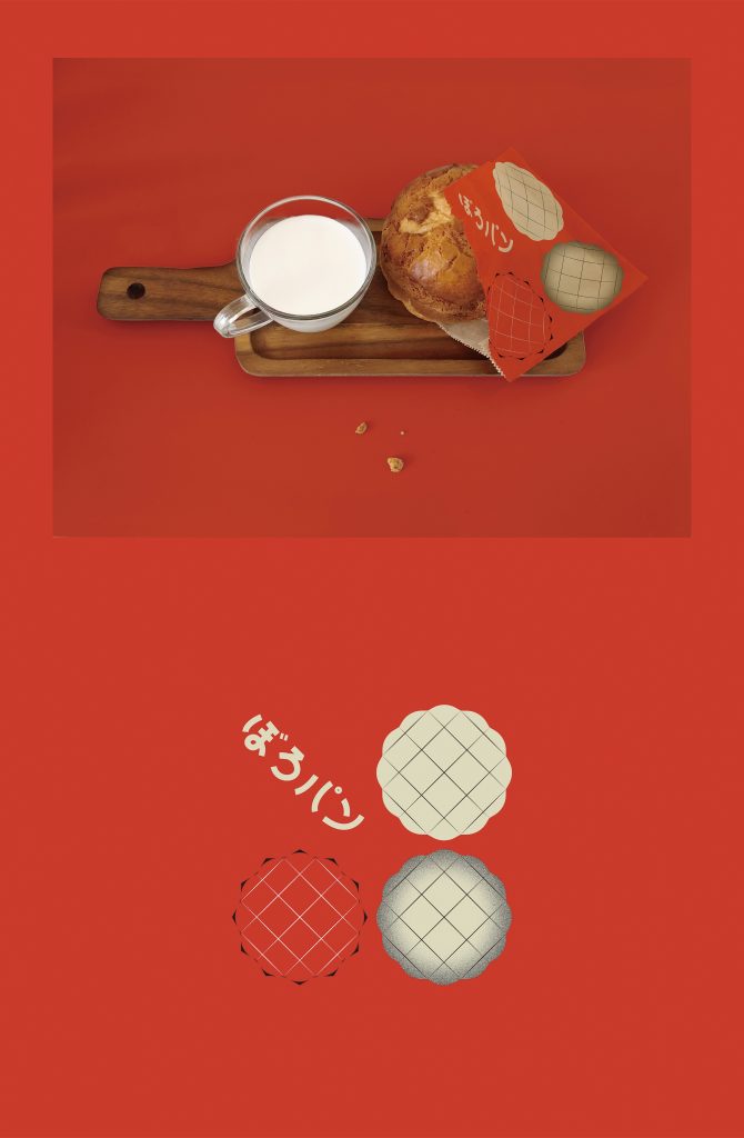
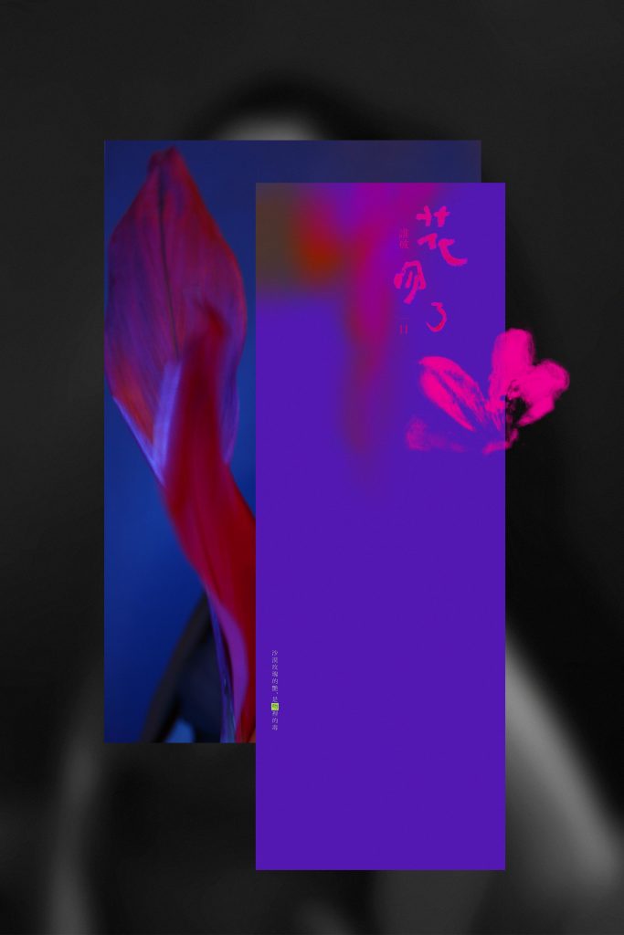
Her preference for ancient aesthetics and modern art are the main inspiration for her design work. Bright colours and decorative elements are mostly used in her works, with the combination of surrealism as her main art style.
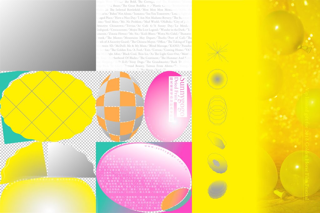
Q: As an interior design graduate, why did you choose to work on graphic design? How did you find the whole transition process?
A: My decision is closely related to my answer in the first question, which is that I am a print and graphic design maniac. Back in my university days, just like my fellow coursemates, I not only focused on interior design but also often made trips to design exhibitions and paid great attention to print designs. What I did not expect was that my love for print design eventually outgrew my university major. Our final year project was not entirely based on interior design only. A major part of it focused on the materials used on the model. With my passion burning strongly for print materials over building materials and graphic over interior, it was then that I’ve secretly made a decision in my heart to expand my future career in the graphic design industry.
The transition process was tougher than I thought it would be. Preparing my portfolio was the first challenge. Looking back, I think – visual wise – my portfolio was good but lacked technical diversity. I had to refer to the portfolios of other graduates as I didn’t have someone from this field to seek advice. The scope of my first job as a graphic designer ranged from organising data and ordering lunch for the office to cleaning and taking out the trash. I probably only did a set of sticker designs then. Because of this, I cherish every design-related task and personnel I encounter even up till now. My best graphic design lessons came from discussions among my colleagues and conversations with print factories. These experiences have taught me more than what textbooks could.
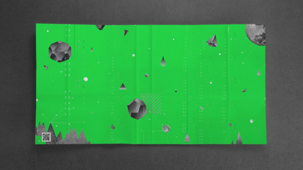
Q: Most of your works feature incredibly vibrant colours along with fantasy-like illustrations. Can you share with us about the role of colour in your work? What is it that attracts you to certain hues?
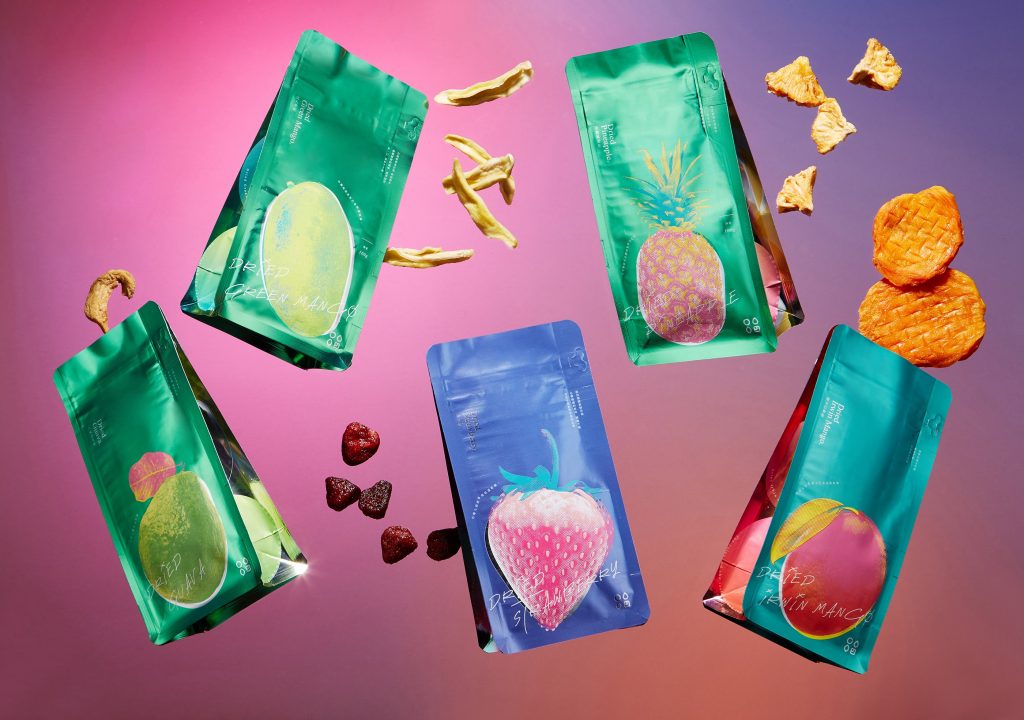
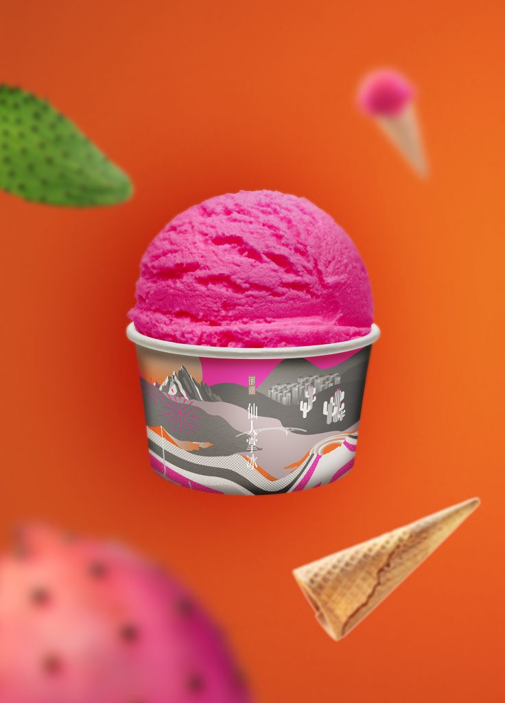
A: In brand planning, colour is used as a medium to classify consumer age and price, also as an element to enhance brand image. The use of vibrant colours in my design is not only out of my personal preferences but partly so that the packaging will be able to stand out among its competitors. I either prefer black and white or extremely vivid hues – there’s no in between.
Currently, most of my works touch on packaging design. The colours are sometimes chosen based on the products. For instance, one of my recent works was related to fruits, hence I used rich colours to visually bring out the flavours. I drew my inspiration from the appearances and flavours of the fruits.
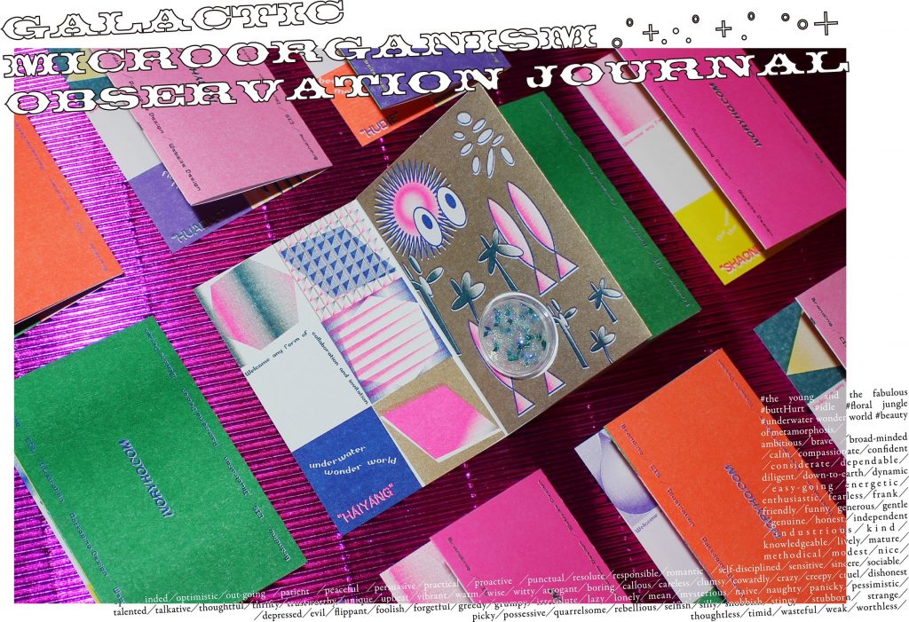
Q: Who or what has been the biggest influence on your work?
A: Ho Chia-Hsing has always been someone I look up to. His works portray a sense of modernity without losing cultural basis. I think the art of blending modernity and tradition is very elegant. I have a collection of his book designs back at home way before I even knew who he is. These good works are what pushes me forward to keep striving in the graphic design industry, and has influenced me greatly on the use of colours.
Designer aside, spending time in art supply stores just to get to know various kind of materials has also played a huge part in my designs. I draw inspiration from the different materials discovered and I’m able to further explore my style of design, so it’s never restricted to a certain pattern.
Q: What aspects of your background and upbringing shaped your creative principles and philosophy?
A: Back in middle school, I used to go through magazines in the library with my mother. I was first exposed to graphic design through fashion magazines. Drawn to the layout of the illustrations and the fashion photography, I hoped that I would be able to draw consumers’ attention as well by utilising avant-garde materials and colours – just as what I’ve seen in pages of the magazines and even in boutique window displays.
Q: You are a lover of both ancient aesthetics and modern art. How do you infuse your passion into your work?
A: Ancient aesthetics and modern art stand on two very different ends. However, when handled appropriately, a blend of both could produce a very innovative design. I think it’s a good way to deliver a concept by using both traditional elements and novel media. But in the end, to portray your personal preferences in commercial designs depends on the overall situation as well.
Good things are meant to be shared. 😉 To see more of Ivory Ho’s work, check out the links below!
Website: ivoryho.com
Behance: IVORYHO design
Facebook: IVORYHOdesign 艾佛里嬉波
Instagram: ivoryhodesign
Tumblr: ivory-ho
Pinterest: IVORYHO design
