Managed by Mann Lao, a seasoned expert in commercial brand design, and Nono Leong, who has years of experience in cultural and art design, together they have won more than 200 awards at exhibitions in over 10 countries and regions, including the International Poster Biennial in Mexico, the International Poster and Graphic Design Festival in France, the One Show in the United States, and the Macau Design Biennial.

Q: What is the story behind naming your practice as “Chiii Design”?
A: Both the founders of “Chiii” have “Chi” in their Chinese names—Nono Leong Chi Hang and Mann Lao Wa Chi. We are looking forward to meeting more awesome “I” to join our studio. When we join hands, it’s “Chiii”.
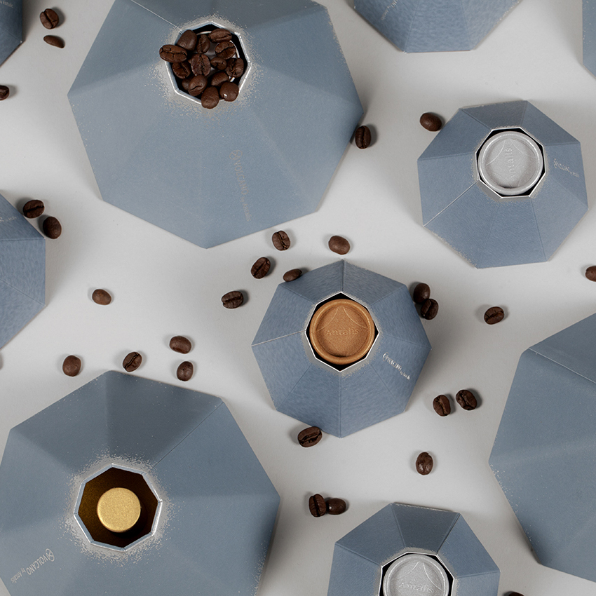
Q: The concept behind ‘Volcano’ is quite a crafty one. Introducing customers to the different types of paper products by using the mechanics of the packaging itself to give a ‘volcanic-like’ effect when each item is dropped into its respective slots – how did you come up with such an intuitive idea?
A: The “Volcano” is a design that demonstrates the possibilities of using more than twelve types of paper products. Our concept aims to create a wow factor instead of a generic paper sample book. We wanted to help the paper company surprise their customers. When we commenced this project, we had thought of the concept of a rocket launch, an explosion, etc and finally went with the volcano idea after considering its mechanics.

Q: Many would agree that a design truly stands out when the right colour combination is used. Why do you think colour plays such a crucial role in the success and failure of a design?
A: Both graphics and colour play a significant role in a design. After coming up with the graphics, we will consider the colour combination that best matches with the nature of the projects. We think that every colour has its own character. Used wisely, colour in design can highlight the character or feature of the brands or products.
Q: How do you, as a team, keep yourselves motivated when you are challenged creatively and mentally?
A: I think we need to put it aside and take a break first! Actually, we hold a “Chiii Chat” every month. It is an internal sharing session where our team members talk about their interests or any topic that they just want to share with others. Our colleagues even shared some military knowledge with us, which was quite refreshing. It’s good to gain some new insights from different people.

Q: What kinds of projects are you usually attracted to? What are the reasons for picking one particular project over the others?
A: We work on a wide range of design projects such as branding, packaging, illustration, etc. However, we are most attracted to projects where our creativity can be put into play. Just like the project “Volcano”, it was not limited to any creative ideas and open to any format that we could come up with. We have had so much fun with that one. Recently, our team is working on an interesting design for another printing house so stay tuned!
Q: As we know, there are many graphic elements that make up an artwork which is something that begins and ends with a designer’s choice and decision. In your opinion, what truly makes an artwork appealing?
A: A designer’s choice and the decision is the magic of the design, and every designer puts his own unique magic into it. It’s hard to say what elements make an appealing work. Perhaps, it’s the intuition.


Good things are meant to be shared. 😉 To see more of Chiii Design’s work, check out the links below!
Website: Chiii Design
Behance: Chiii Design
Facebook: Chiii Design
Instagram: Chiii Design
